My IKEA Project was the first piece of Coursework for my A-Level Graphic Design, for which I got an A* , 198/200.
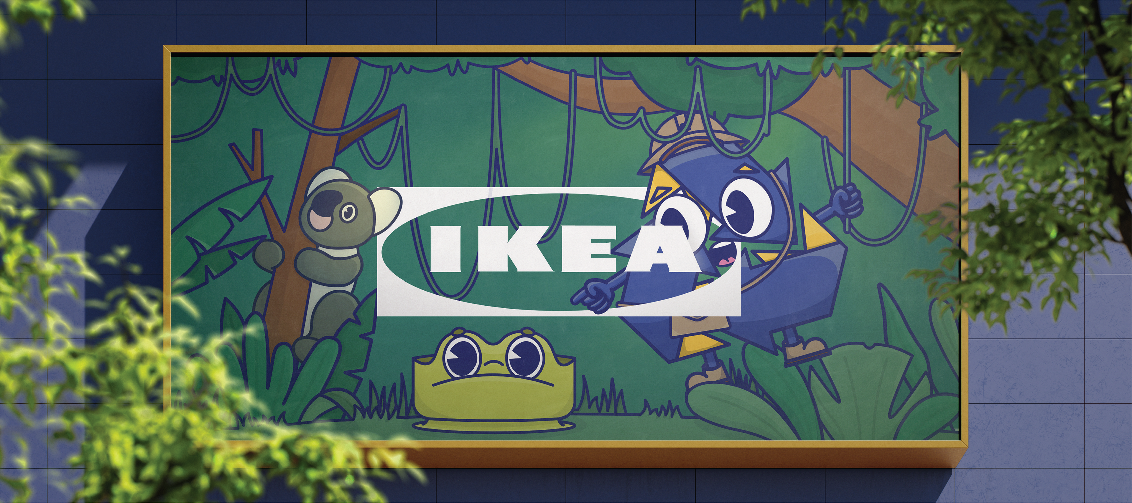
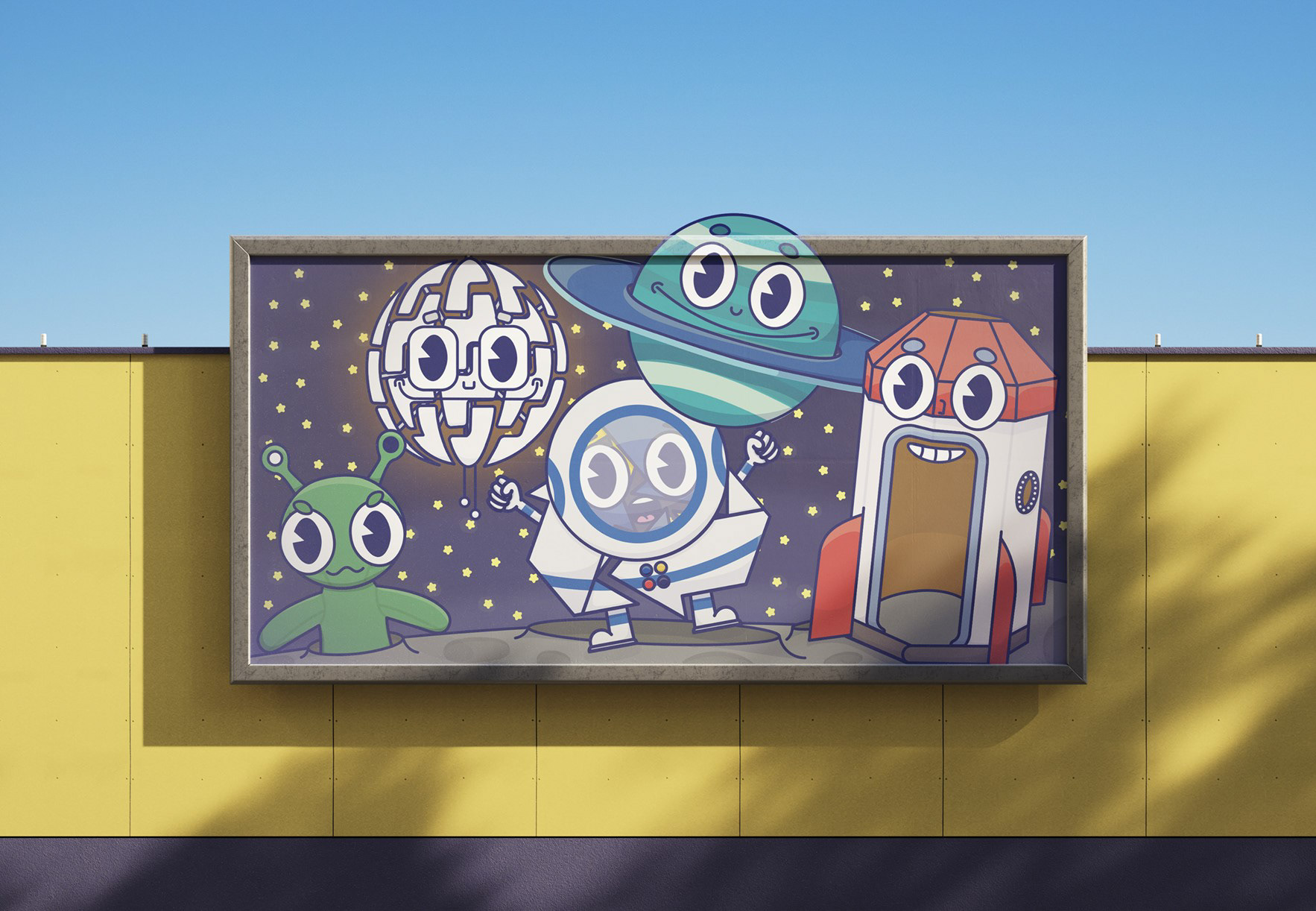
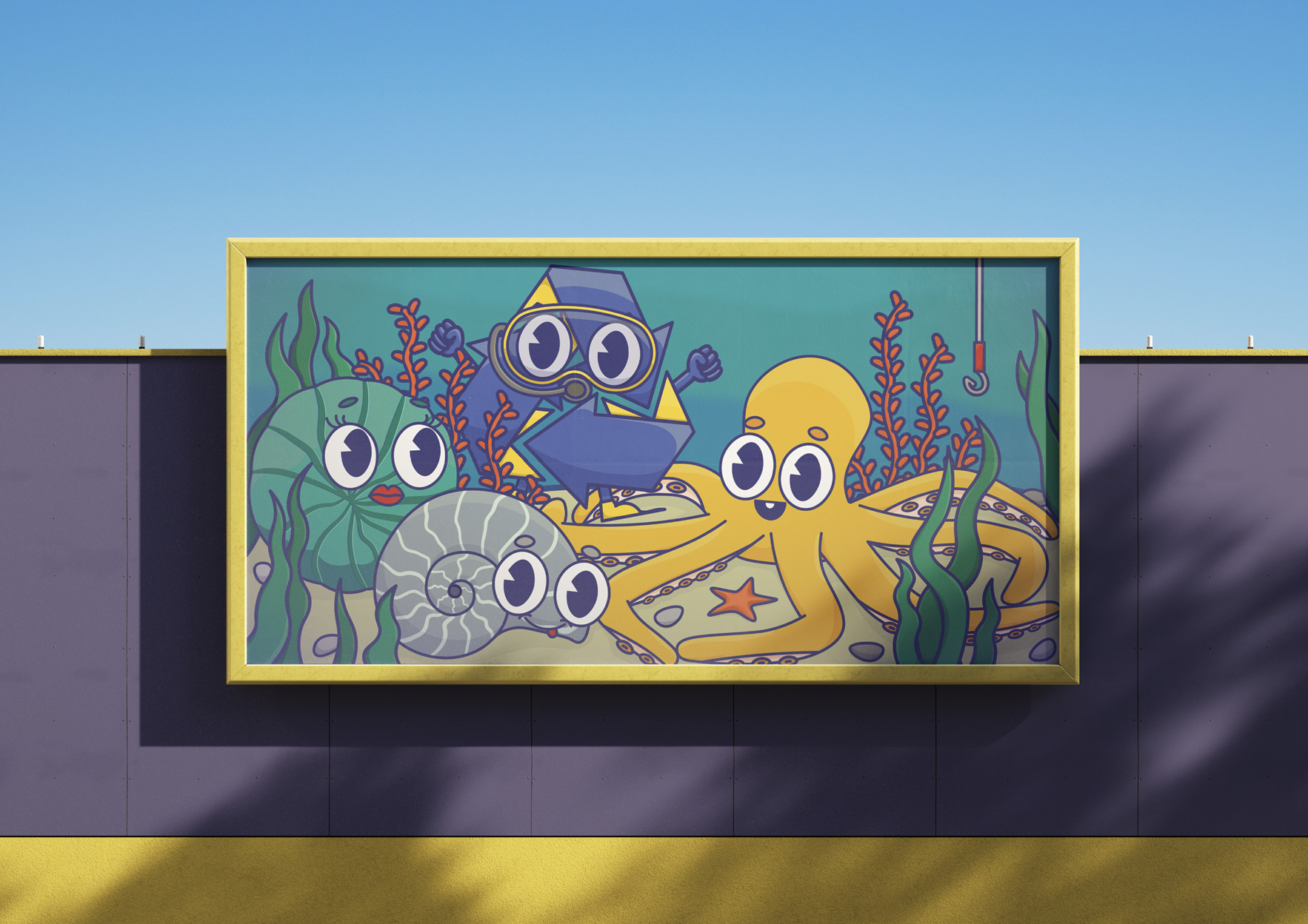
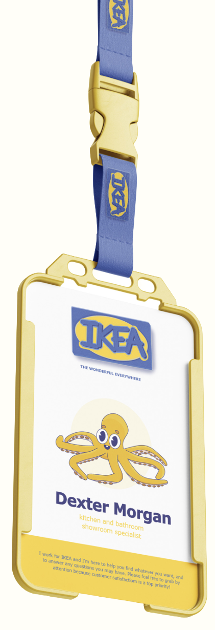
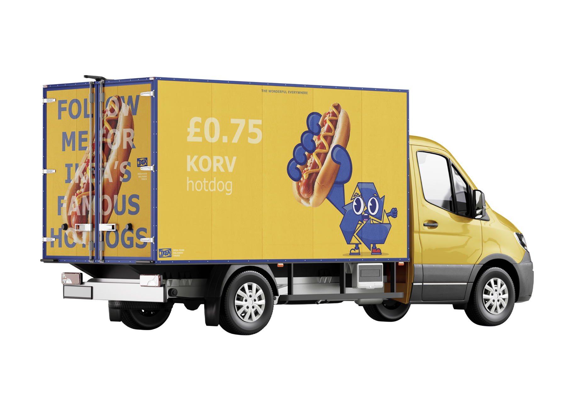
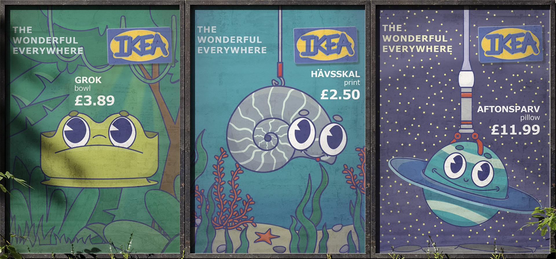
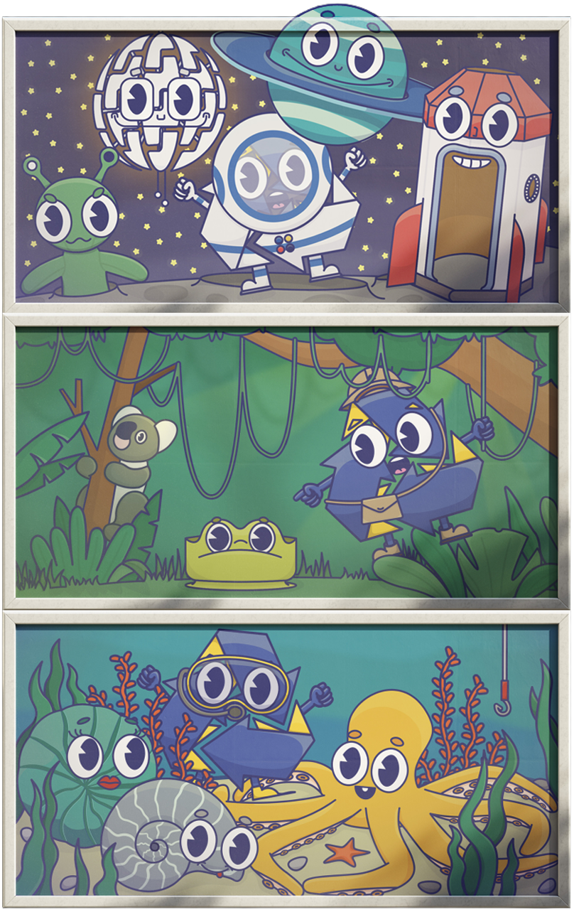
The brief for the project was 'cuteness', so I decided to give IKEA a set of child-friendly characters, which could be continuously added to thanks to the simple style.
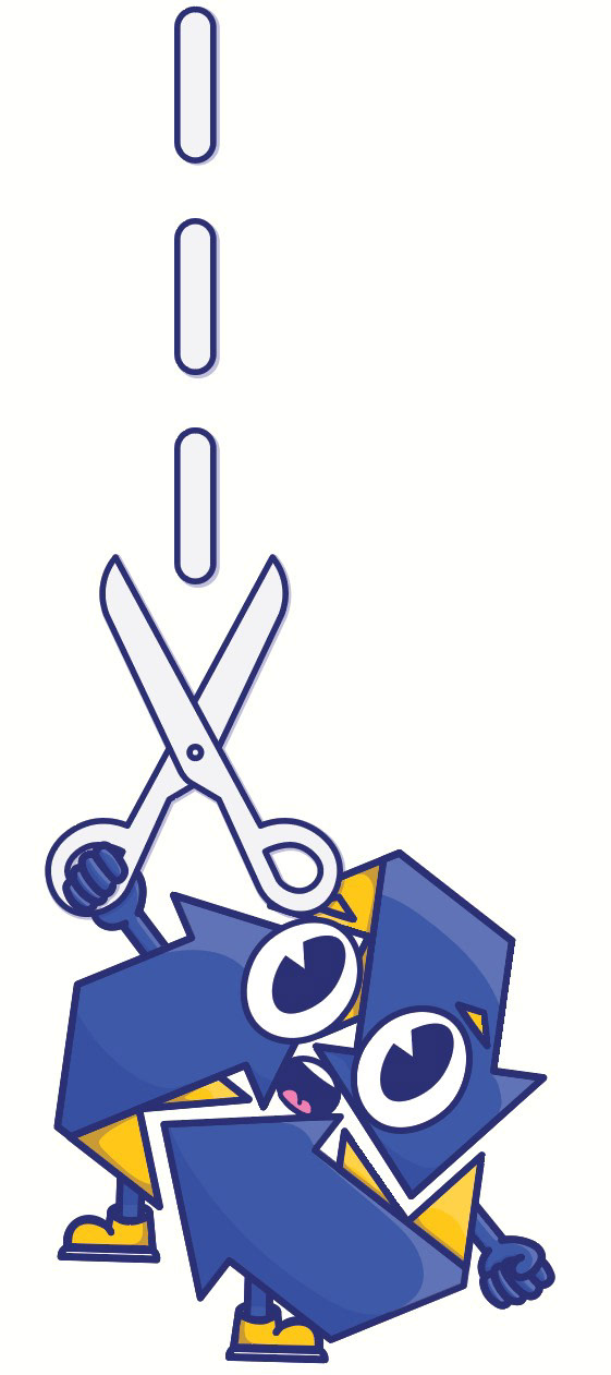
All of the characters, excluding the recycling symbol, are real existing IKEA products: the blue planet = AFTONSPARV cushion.
Throughout the project, I used Adobe Illustrator for the designing as well as Photoshop for mock-ups. I think the mock-ups are super useful to display how my designs may look on a real billboard, and aspects like the natural lighting can really bring life to the designs.
Given the 'cuteness' brief, my characters were mostly inspired by the 'Rubber-Hose Animation Style', e.g. 1920s Mickey Mouse. Consequently, I wrote a 2,500 word essay detailing the history of the style, as well as how certain features can be seen to this day. Thanks to this extra context, I developed a much better understanding of the style, which lead to my first commission - the Norwich Games Festival Character 2025, after this design was seen at The Forum's exhibition.
© Copyright | All rights reserved